

Colour Outside The Lines
Yes, we get it… Asking someone to add a splash of colour to a space can be an incredibly daunting task, especially for someone who is still incredibly addicted to all things BEIGE! It’s one thing to go for something modern and minimalist, however, adding a splash of colour to a room can help elevate the space by highlighting features, architecture and adding a great deal of depth as well.
So whether it’s simply adding colourful furnishings or decorative elements, we would strongly encourage a good bucket of quality paint, or even wallpaper, and go to town! But, before you just dive in and start colouring outside of the lines, take a look at our insights further below.
Creating Depth from Floor to Ceiling
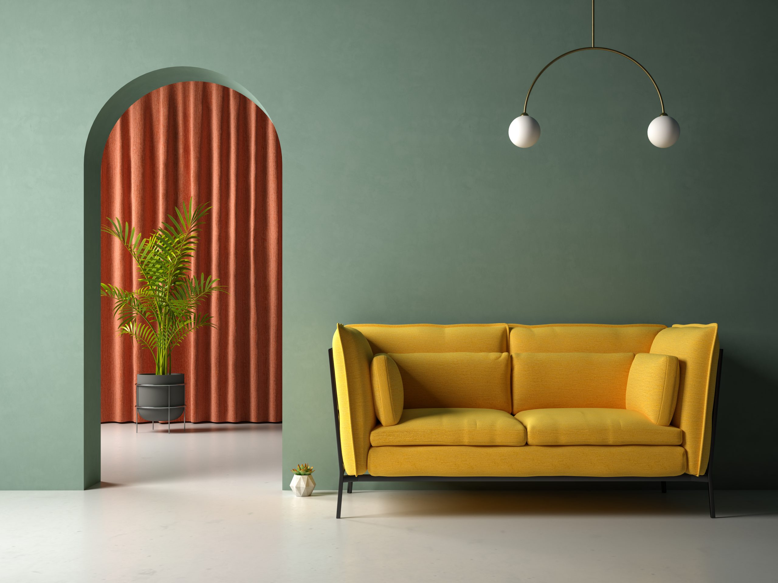
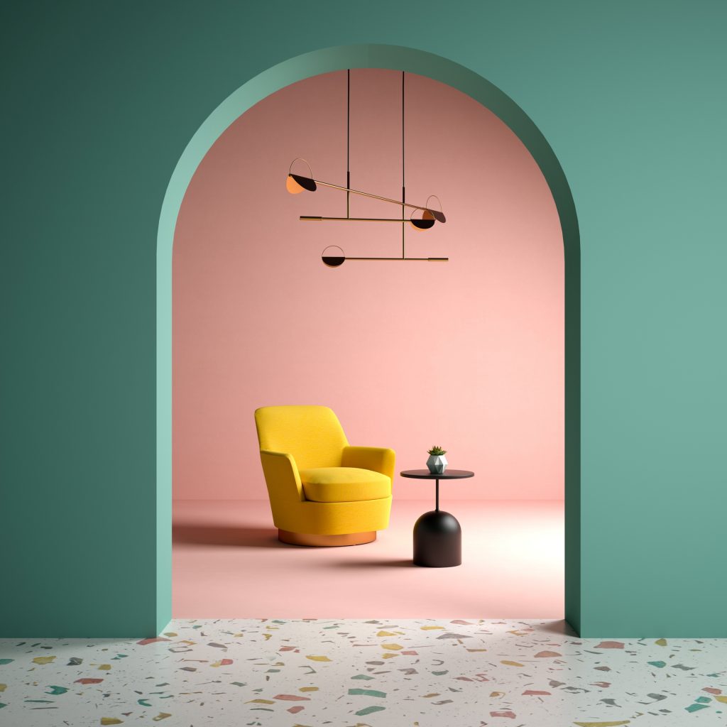
One of the best ways to create depth in your space and elongate your space is to understand how best to pick colours. Our advice is to start with dark shades/colours for floors, medium colours for walls and then lighter colours for ceilings. This flow mimics the outside world, in that darker shades are usually at your feet, medium/neutral shades at eye level and the brighter colours overhead.
If you are creating a space that is more dark and moody, you can consider using lighter or medium shades on your floors and your darker/darkest shades on your walls. If this is the case, you’ll need to add warmth with more lighting so that your moody space still remains practical and adds depth and dimension.
Let’s Make An Entrance!
Confused about where you should start? Most people are. So here is our pro-tip for renovating and re-designing a home or office space. Start with your formal spaces first, and then integrate your primary colour schemes or decor themes throughout the rest of the spaces to ensure consistency and flow from room to room.
This means start with your entrance spaces, then your dining room(s), and slowly move further inward by using a varying shade of your primary shades from the formal spaces. e.g. if you have a red sofa as a feature item in your living room, try burgundy in your dining area or home-office.
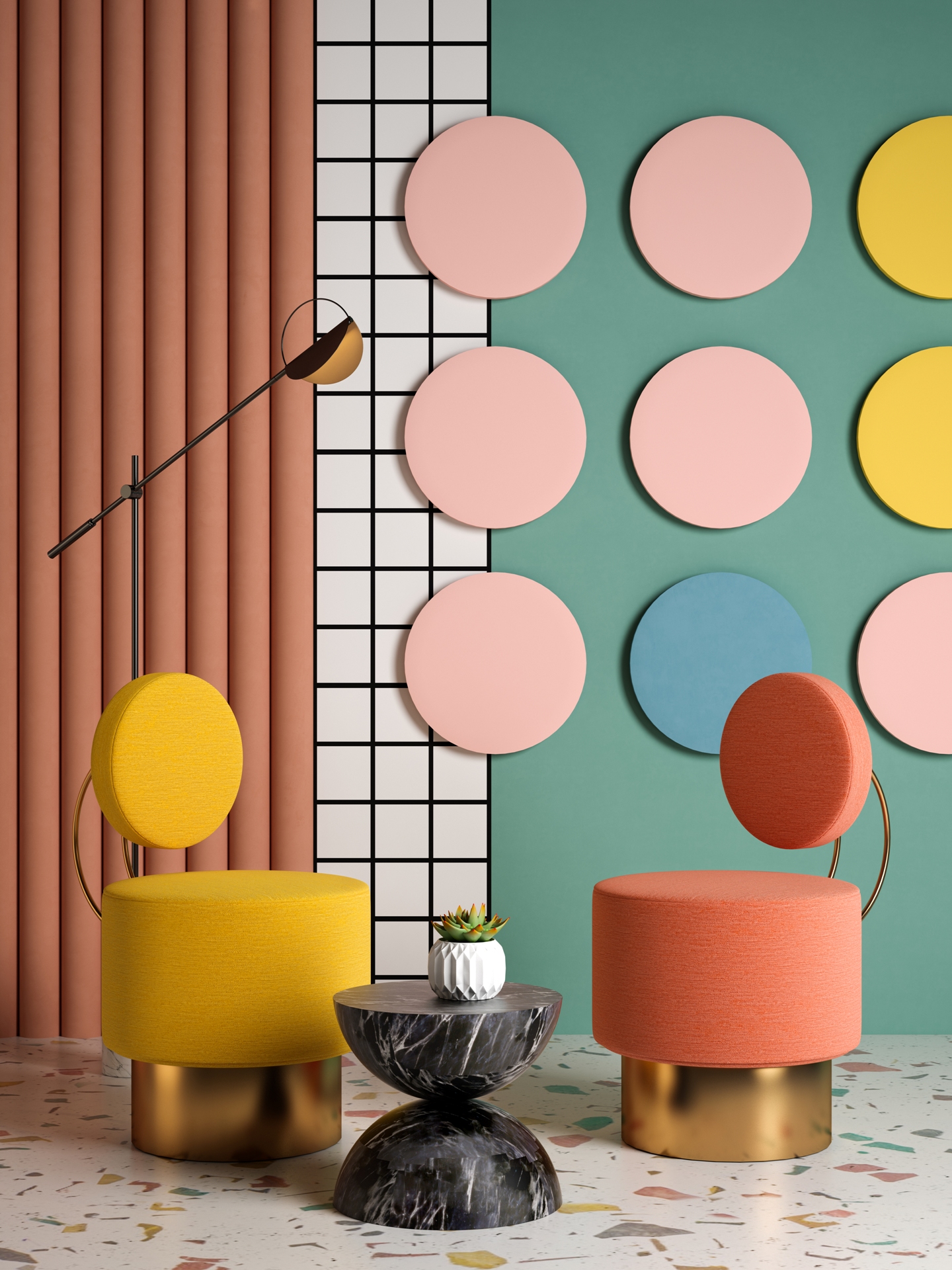
A Colour Concoction of 60:30:10
When decorating your home or office, try using a well-balanced ratio of 60, 30 and 10 to balance colours so that they don’t become overwhelming. What does this mean? It’s easy… Use 60% of your base colour (on your walls), 30% of your secondary colour perhaps on upholstery and furnishings, and finally, 10% of your accent colour scattered throughout your accessories. This creates a subtle balance of colour throughout your room and gives you a great place to start.
I Love Your Accent
We love accents! That’s right, accent colours can easily become quite the highlight in a space when it’s used throughout key elements that make up a space, such as accessories, wall items and fixtures. This works best when using bright and bold colours that stand out against subtle/muted tones.
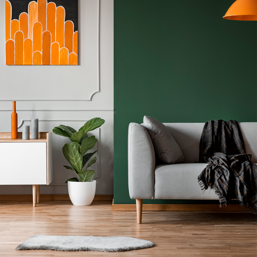
A great idea is to choose a smaller walled area to create an accent wall, such as a fireplace or a load-bearing wall. However, remember that adding too many bold colours may cause a conflict with the flow of energy and create a lack of focus within the room, so play carefully with your use of bold colours.
No Comments